AssetBook | Re-Branding… and Expanding
The PLOT: Our work with AssetBook, a single-product software company, began with a plan to refresh their logo and talk about expansion that was in the planning and development stage already. It would be a separate, but complimentary, product they felt would attract the same market as their existing software (used by independent asset managers and financial advisors), but was a solid step up in terms of features and functionality. It would need to be branded.
AssetBook had entered and established themselves in the industry with a successful medium-level (in complexity) software product that appealed to independent financial planners with accounts not exceeding a certain amount. It was, in fact, called AssetBook. In the simplest terms they knew their consumers and they sensed a desire for more – bells and whistles – even if they weren’t breaking that ceiling for asset management. Their tech support is intrinsic to the product and with a direct line to the user they were privy to their wish list: upgrades that save time, showed more “views” across a portfolio and more horsepower to handle more and bigger responsibility. The folks at AssetBook perceived a niche and wanted to be there, ready and waiting, when their existing customers began to look for ways to be jettisoned into the next financial management stratosphere.
All good news, but there were a couple of specific branding irregularities to iron out. In the early excitement of launching the first software it wasn’t a priority to map out a strategy for a second product. Not that unusual, but the time had come to look at the relationship between brand and product and make decisions about the fate of both. It would be difficult to introduce another product called AssetBook with wildly more sophisticated features and still keep the loyal, original subscribers who felt comfortable with it and see no need to spend more. This being a subscription online product it’s not as simple as AssetBook 2.0, at least from the perspective of a non-computer fanatic.
Thinking in positive terms this is a great position from which to be navigating. The most worrisome identity concern was that if either of the products fell out of favor with the public, the corporate name would be forever tethered, by name, to something best forgotten by the industry. Because this “condition” had developed during profitable times, the temperature was lukewarm, at best, when the topic of discussion turned to "taking a different tack this time around". Once the creative "machine” was oiled and the wheels began to turn there was agreement that the new product would need to have its own identity and become part of the bigger brand, but not supplant it, in the interest of upholding the company’s value proposition and maintaining brand trust and loyalty.
The New Proposition | A Tagline for AssetBook
In advertising there’s a starting point an usually, no always, there’s a learning curve and research is the only way to master it. In many ways it’s good to know little about the topic so that it actually is “discovery” that’s happening. There’s nothing more exciting than finding out about a new universe and becoming a voyeur for a short time. Financial management is a complicated business with aspects that could not be unearthed without consuming the schedule so in the interest of time, the technique used to understand thoroughly was extraction of key points and distraction from the industry jargon rather than mastery.
What did reveal itself consistently was the idea of the numbers being “seen”, in comparisons, in contexts and in a complete “view” of their values. In other words, the reports that can be generated are useful figures that put the portfolio in perspective, not just for the planner but for his/her client. The software have the predictive qualities that make managing a portfolio possible because it provides consistent and reliable data. That’s really the nut.
So that lead to a list of a hundred or so taglines. There were a few frontrunners: “Nothing But Net”, referring to profits; “See the Forest and the Trees”, underscoring the importance of knowing what you’re looking at; “The Art Of Numbers” as an abstract less traveled road for finance; and “A Better View”, which ultimately, became their final choice.
As an aside, there was a very clear message coming from the client that “freelance financial managers are the “cowboys” of the industry”. No big high-rise corporate suite, just a desk and a computer set-up in a home office or corner space in an apartment. Since the “cowboy” metaphor was a bit specific and may not be relatable to everyone, the client was asked to consider the idea of a “Superhero” as a means of imparting trust and reliability as part of the identity of AssetBooks customer. If they see themselves as that, then, can they be sold on a product that possesses those characteristics as well? Together they can save the world!
A Name for the Super-Product
So if there’s a new superhero and his super power is to be able to see through the data and hear when there’s a great investment, what should he be called? He might, with his hyper-vision and impeccable mastery of, well everything important, it might be said he possess some kind of RADAR. Not in so many words, but there’s a lot of allusions to comic book concepts with a real world application written into the promotional text (and so many puns). But a sense of humor about some topics really makes them seem less daunting and brings them down to earth. Saying helpful, functional features are a “dynamic trio”packs them with credibility. The lucky break that AssetBook was already working with a program called “Safety In Numbers” helped support the theme and simply saying that the product allows you to do a “flyover” of the data is just aids in visualizing how well it works.
Exhibit “A”
Displays and exhibits are much more affordable now that we’re two decades into the millennium. They serve as a place for your value proposition to be broadcast with style and sophistication – and they’re big, An investment in this design and execution is wise if you hope to compete in world or regional markets. Most businesses know what kinds of trade show opportunities are available to their industry, but it can be intimidating to throw your hat in the ring with this much gusto. Good planning and solid messaging along with a persuasive, eye-catching aesthetic can make a small start-up look better than an established industry leader. If you have designs on starting something, that’s the way to do it! When RADARMAN made his trade show debut attendees were helpless to resist his bigger-than-life cutout (far from the entrance) in a sea of exhibitors. Find out more about Display & Exhibits.
It takes a certain amount of enthusiasm and follow-through on the client’s part to breathe life into a mascot. It requires vision and trust to set the stage for a show of creativity that far off the beaten path. But this is the spirit of advertising at its most fulfilling and remarkable. It builds pride in the brand and buy-in from staff. Imagining and creating a recognizable symbol, that goes beyond a logo, goes back to the beginning of advertising. Icons we know and love like Quaker Oats’ “Quaker Man”* (who is actually Willian Penn, the founder of the Commonwealth of Pennsylvania) and Esso’s Tiger have worked a lot of overtime confirming that oatmeal’s goodness, and likewise the gas in our car, will keep us running.
*The QO Man was chosen because his Quaker faith projected the values of honesty, integrity, purity & strength. And that’s still a powerful value proposition even after more than a century!
Print & Collateral
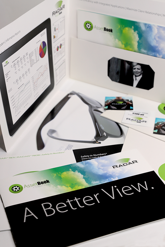
A sales kit folder with inserts that change and update information, as needed, is used for trade shows and mailers. As customer feedback is captured it can be translated into new collateral pieces with updated text that answers ever-changing customer questions to fuels sales. Next to the living brochure that is your website, this vehicle serves as an adaptable in-hand sales tool that compliments all other modes of communication. Find out more about Print & Collateral.
Thumb Drive Premiums
Thumb drive wallet cards are a great branded giveaway for trade shows and conventions.
Branded thumb drives can be used to share product details, video, catalog info and other data.
A Living Brochure | The Website
Yes, your website is an incredible and affordable way to reach your audience. Period. There’s so much to say about it that a link to intro page is the best way to present that information. Find out more and see our portfolio of Commerce Web Design (with online stores) or Non-commerce Web Design sites.
Interactive pop-up prompt for more info on each team member.
