The Birth Of SEYMOUR | An Arts Project
The PLOT: This client had a very specific goal in mind: Take a hugely successful art event that’s known mostly for crafts and hobby art and forever change it’s mission statement using a new brand and logo with two built-in messages. The first message was that, due to a state mandate, that had been on the horizon for some time, the event would shift its focus from 50% hobby crafts and 50% fine art to a new mindset that elevates the art to 100% juried, fine art and fine craft. This was a brave move and required substantial persuasion inside and outside the organization and its board.
Eloqui produced this video for SEYMOUR’s inaugural event at Simon Pearce
Identity | Message and Mission
A SKU (abbrev. stock-keeping unit) became the vehicle for saying “Commerce” in a subliminal way and lead the viewer to look beyond the graphic to a deeper message that says “this art is for sale". The addition of random color suggests abstract art.
In this case the client had a very specific goal in mind: Take a hugely successful art event that’s known mostly for crafts and hobby art and forever change it’s mission statement using a new brand and logo with two built-in messages. The first message was that, due to a state mandate, that had been on the horizon for some time, the event would shift its focus from 50% hobby crafts and 50% fine art to a new mindset that elevates the art to 100% juried, fine art and fine craft. This was a brave move and required substantial persuasion inside and outside the organization and its board.
The second ambition was to send a decidedly commercial message that spoke to the necessity for artists to sell their work and profit from it, in order to support the effort put into creating the higher-level craft that would be required to be juried into the show. Pretty lofty stuff, but one thing it had going for it (from a designer’s perspective) was that there was nothing subtle about it! This branding would be unashamed and straightforward and it would be happening very quickly. Within months, the message would be broadcast not just to art patrons and casual buyers, but it also needed to communicate something that would be difficult to say: Some loyal artist participants wouldn’t be invited back, even to be juried, in the next season of an annual event, then, in its 18th year.
An advisory committee comprised of 4 artists (from varied disciplines), the director of the program and a member of the governing Arts Council board was gathered to be the deciders of how this would be done. The process began with the artists expressing their concerns about the impending changes, existing challenges of selling and finding new markets in a rural community, the blessings of having a following because it is small place and, most concerning, whether any part of existing structure of the event would survive this drastic makeover.
As the group discussed some of the political and personal conflicts that would, undoubtedly, arise through the stages of the overhaul there came a realization that the artist/vendor “herd" would be thinned considerably as fewer artists would meet the criteria for application. That meant there would be a recruitment effort to plan and execute. There was already an art faction, quiet but well-known, who felt their work was “too fine art” to be in a venue that was so overtly “crafty”. When they did participate their sales were disappointing as they watched customers walking around with bags brimming with $20 craft items. So there was another challenge: To convince that group of fine artists the reconstruction of the foundation is not a “trick” to increase participation and revenue… it was actually answering a call they had never dreamed would was being heard.
This image of the warehouse was taken on the off chance it would work as a cover page on the website.
As the word spread it got very “real”, but it was fascinating to watch how magnanimous many crafters were about being nudged aside. There was actually much more understanding of why this was important to artists who support themselves by producing art. As an aside, the Chamber of Commerce, happily created a replacement craft event to which the hobbyist merchants shifted, almost seamlessly.
Exactly how these problems were solved is complicated, as it should be. The way the process works has as much to do with the client(s) as it does the consultant(s). That’s a fact at the the start of every project. It’s part of what’s viewed as “discovery” nowadays. It’s a very unique experience each time. These highlights will follow the evolution of SEYMOUR; the shifting and building a new place in the art market, and the hard decisions that could have made more enemies than friends. Additionally, while still in its infancy artists were asked, in 2020, to stretch their imaginations and patience to reach out to markets beyond the familiar standard, in-person vendor-meets-public art shows in response to a plaque on commerce like no other. SEYMOUR had to go virtual.
In the first two years SEYMOUR (2018 & ‘19) partnered with the successful glassblowing business, Simon Peace, and used their warehouse as the venue. The event takes place during a fall festival and enjoyed a robust attendance and impressive sales. Those steering the event had secured an web presence with a dedicated site, and social media engaged, and were preparing to expand to a commerce component and online store. That investment of time and funds turned into a new online event to adapt to a virtual version of the show in Fall 2020. Marketing tools like billboards and banners have all been utilized and social media became a driver of visitors to the site. Sales also increased in the physical Gallery Shop (with social distancing and state mandates being followed).
The Name | Starting From Zero
Because the client was starting with an unnamed entity the process started from that point. The event organizers had already committed to a large warehouse venue with assurance of using it for at least two years. So the industrial space influenced some of the concepts. The coincidence, for instance, of a warehouse pallet and an artist’s palette became a conversation and was second only to the SEYMOUR idea. Knowing that the domain name would be an important part of the brand the committee had an immediate appreciation for a web address like SEYMOURart.org. By personifying the brand with this fictitious person’s name, which sounds like “see more”, there was great enthusiasm for its promise of limitless possibilities. With regard to the arts, just put any word to the right of “see more” and you have a new brand that can highlight another art form… SEYMOURdance.org and expand departments under one umbrella.
The Leap To Online Stores | Commerce Serves Patrons
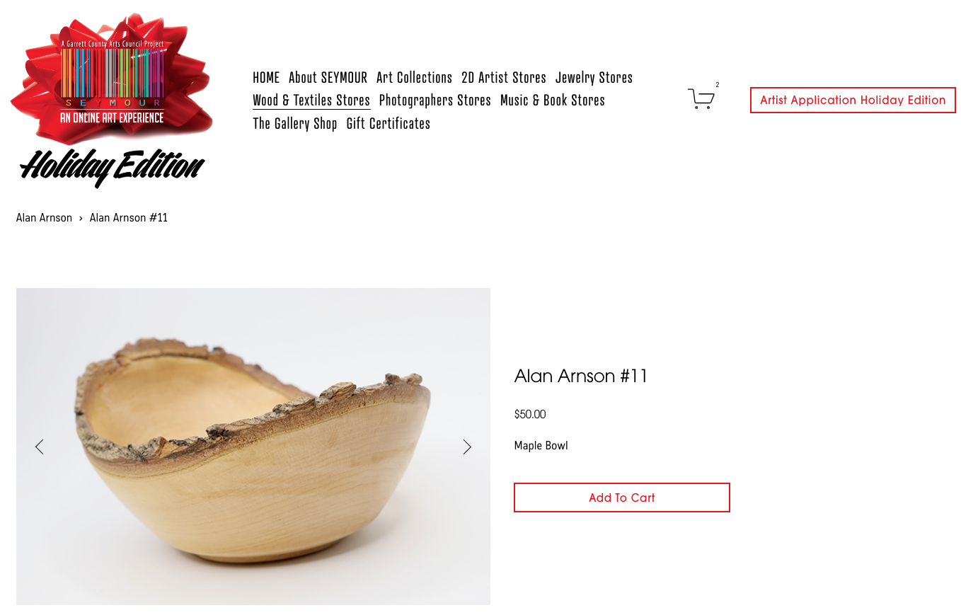
Online sales and product stores are a basic part of website design now and are set up to make taking payment and customer management and service. Mailing lists and subscriptions for membership are also a part of any website that’s intended for cultivating relationships with a specific market. Branded premiums like shopping bags and coffee mugs, and related products have value for the public. Online sales provide a way to keep your name and logo in homes and businesses, and on the minds of potential patrons when in-person connections are not easy to make, with a return on investment that’s proven for non-profits. Of the many ways there are to fundraise, small-scale product sales are one of the safest bets if you keep the initial investment modest and test products to see which are the most popular before taking a major plunge. If you have an organization that represents artists their products that may not bare your brand, but are part of a broader relationship between you and the artists/events you promote.
Creating an online store is a basic feature of most websites that interact with subscribers and patrons.
Print & Collateral Materials | Print Builds The Brand
Click images to enlarge
Mock-ups, comprehensives and prototypes are presentation tools used to help visualization and to quickly organize ideas, especially when approvals are made by committee. For the process to be its most productive, the options must be clear. Even the most experienced and savvy of creatives appreciate having the benefit of comparisons to weigh the possibilities fairly, with an array of ideas.
Billboards Reach All Markets | Brand &Product
Budget | Is It Really Holding You Back?
It’s rare, but sometimes the most expensive idea isn’t as much fun as something fast and cheap! Consider a nighttime fireman’s parade with sirens and flashing lights and a sea of shadowy figures all trying to be seen. The need for branded shirts for everyone is established, but what then? Once it’s dark it makes no difference how many colors are on the shirt. The 1960s velvet poster blacklight in a hand-held flashlight version makes something wild out of a simple black and one-color (white) printed shirt. Originally, not the first choice but by first nailing down a primary objective — “being noticed”, sometimes you can create quite a stir with very little cost.
Objective #2 for this PR project was to hand out branded black-eyed susan seed packets. The design was particularly satisfying because there was an artist participating in the show who had a series of illustrations showing a character planting seeds in a positively artsy way. It was decided, unanimously, that his art would be on the packet, thus promoting the artist (the artist granted use of the art pro bono) as well as SEYMOUR.
New Seasons & Reasons | Brand Adaptation
Maintaining a strong and consistent brand is vital to brand recognition and brand trust. But there are subtle ways to “rebrand” for special projects and partnerships. This works after the brand has saturated into the community. Creating and abiding by a style guide is the best way to keep consistency in the way the brand is used internally and by those who offer to promote your efforts and products.


